Building ThinkMarkets' Design Foundation
Summary
- My Role: Spearheaded the design system project from research to delivery, focusing on scalability, accessibility, and efficiency.
- Team: Collaborated with two product designers, engineers, and stakeholders across the organization.
- Duration: 4 weeks.
- Overview: This project addressed inconsistencies across ThinkMarkets’ digital platforms by creating a scalable design system. The system unified design principles, standardized components, and streamlined workflows, improving both user experience and team efficiency.
Introduction
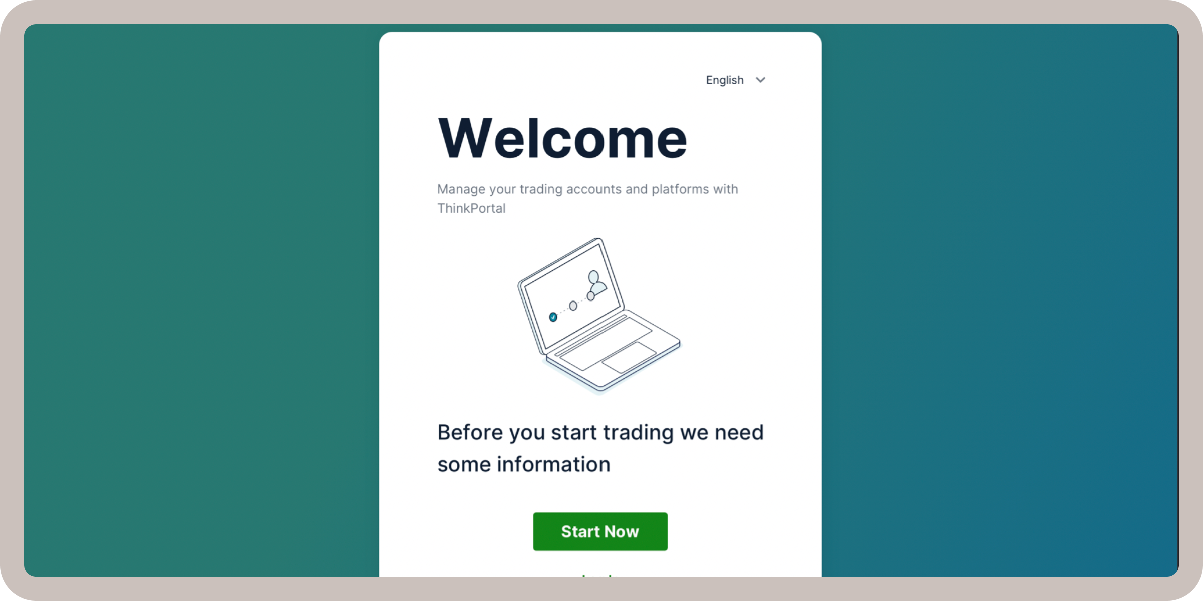
When I joined ThinkMarkets, a global fintech company, I recognized a significant challenge: inconsistency across its digital products. Without a unified design language, the user experience suffered, and cross-functional collaboration became inefficient. To address this, I spearheaded the creation of a scalable design system, laying the foundation for a cohesive and accessible user experience. This project wasn’t just about fixing visual inconsistencies—it was about creating a system that supported collaboration, streamlined workflows, and delivered a seamless user experience to ThinkMarkets’ global audience.
The Research Phase
Understanding the Problem
Multiple stakeholders expressed dissatisfaction with the current user interface design, prompting the need for a deeper understanding of the brand's goals and user expectations. As a starting point, I conducted a series of workshops to establish a mental model of the desired outcomes and ensure alignment across teams.
To avoid getting lost in the complexity of this project, we wanted to establish clear research goals. These goals provided structure, helped prioritize tasks, and ensured that every subsequent step aligned with the broader vision of creating a cohesive, scalable design system.
Key Goals for Research
- Understand the Current Brand Language:
To ensure the design system felt authentic to ThinkMarkets, I needed to analyze the existing brand identity and determine what was working and what wasn’t. This analysis provided critical insights into the brand’s strengths and opportunities for improvement. - Identify How the Brand Wants to Position Itself in the Future:
A successful design system not only reflects the present but also positions the brand for where it wants to go. Talking with stakeholders and facilitating workshops helped our team understand ThinkMarkets’ future goals and how the design system could support this evolution. - Define Core Components and Elements Needed for the Design System:
Understanding the essential building blocks allowed us to focus on what mattered most, ensuring the system was efficient and addressed not only the organization's needs but also the immediate needs of our design and development teams.
With clear goals in place, I moved on to collaborating with stakeholders to explore deeper insights and align our design vision.
Stakeholder Collaboration
Engaging Stakeholders to Shape the Vision
To ensure the design system met the needs of ThinkMarkets, I facilitated a series of interactive workshops with stakeholders from various departments. These sessions were instrumental in uncovering their pain points, aligning on key priorities, and brainstorming creative solutions.
Exercises Utilized
The workshops were designed to be both structured and exploratory, combining strategic exercises with open discussions:
- Brain Games: Facilitated collaborative activities to generate brand-related keywords, helping stakeholders articulate their vision in a creative and engaging way.
- Visual Competitive Analysis: Conducted a detailed analysis of competitors’ design systems to identify opportunities for ThinkMarkets to differentiate itself while setting a high standard.

The insights gathered from these workshops provided a strong foundation for the next phases of the project. Armed with this information, I turned my attention to auditing ThinkMarkets’ brand assets and existing design interfaces to create a roadmap for the design system.
Brand Audit
Grounding the Design System in Brand Identity
With insights from stakeholders in hand, I turned my focus to auditing ThinkMarkets’ existing brand assets. This was a critical step to ensure the design system reflected the company’s identity while addressing gaps and outdated elements. The goal was to modernize the brand’s visual language while staying true to its core values.
Key Findings From the Brand Audit
1. Typography and Color:
- The existing brand book’s typography lacked hierarchy and clarity, making it difficult to scale across platforms.
- The color palette was outdated and failed accessibility standards, limiting flexibility for future use.
2. Core Values:
- Keywords from the brand book, such as Smart, Resourceful, Hopeful, and Mature, became guiding principles for the design system.
- These values provided a framework to ensure every decision aligned with ThinkMarkets’ brand ethos.

I used the keywords to shape design decisions, ensuring they influenced the typography, color palette, and overall tone of the system. For example:
- Smart: Focused on clean, sharp typography and efficient layouts.
- Mature: Professional and consistent styling throughout multiple products.
With a clear understanding of the brand’s visual and emotional foundations, I next evaluated ThinkMarkets’ existing design interfaces to identify inconsistencies and opportunities for improvement.
Interface Audit and Benchmarking
Uncovering Gaps and Setting Standards
To bridge the gap between the brand identity and the user experience, we conducted a detailed audit of ThinkMarkets’ current design interfaces. This process revealed inconsistencies and inefficiencies that needed to be addressed to ensure scalability and usability. Additionally, we benchmarked against industry-leading design systems to guide improvements.
What I Learned from the Audit
- Inconsistent Components: Variations in buttons, input fields, and other components led to fragmented user experiences.
- No Typeface System: A consistent hierarchy for headings, subheadings, and body text was missing.
- Lack of Design Principles: Decisions were ad hoc, with no unifying framework for consistency.
- Outdated Color Palette: The palette was inflexible and failed accessibility requirements.
Benchmarking for Inspiration
To guide the design system’s development, I referenced industry-standard systems such as:
- Google’s Material Design: For scalable and accessible components.
- IBM’s Carbon Design System: For its clarity and professional tone.
These benchmarks provided inspiration while ensuring ThinkMarkets maintained its unique identity. Armed with insights from the research and audit phases, I transitioned into ideation, focusing on defining core design principles and prototyping scalable components for ThinkMarkets’ design system.
Ideation Phase
Laying the Foundation for a Scalable Design System
As a team, we dedicated a week to ideating and exploring various design directions. This phase was critical for defining the core principles and atomic components that would form the backbone of the ThinkMarkets design system. At this stage, our focus wasn’t on creating a large-scale enterprise-grade system but rather on building a solid foundation that could evolve over time. By focusing on collaboration and creativity, we ensured that the final design system addressed both stakeholder priorities and team needs.
Narrowing Down to Core Components
Through discussions and collaborative exploration, we narrowed our focus to a targeted set of core components. This approach ensured that we could start building immediately without over-complicating the system. These components addressed ThinkMarkets’ immediate needs while remaining scalable for future growth. Key areas of focus:
- Design Principles: Establishing a shared framework for consistent decision-making.
- Typography: Creating a simple, flexible hierarchy for readability and usability.
- Core Components: Starting with fields, lists, and radio buttons, which were the most used across ThinkMarkets’ platforms.
- Color Palette: Introducing accessible and modern colors to refresh the brand.
- Iconography: Selecting clean, recognizable icons to enhance the system’s usability.
By focusing on these elements, we built a system that was manageable, effective, and capable of supporting ThinkMarkets’ design needs right away.
Collaborative Ideation Sessions
We approached ideation through a balance of individual and group collaboration:
- Individual Exploration: Each team member explored potential design directions independently to encourage creative thinking.
- Group Collaboration: During team sessions, we presented our concepts, debated approaches, and refined ideas together.

This iterative process ensured that we combined diverse perspectives while aligning on priorities. With clear principles, a narrowed scope, and validated components, we transitioned into the design phase to bring ThinkMarkets’ design system to life.
Design Phase
Establishing Design Principles
To guide every design decision, I led team exercises to establish a set of core design principles. This collaborative approach ensured alignment across the team and created a strong foundation for the design system.
Our Design Principles:
- Speed – Keeping interactions and visual designs lightweight and simple.
- Build Trust Through Clarity – Designing consistent, approachable, and secure experiences.
- Attract Experts, Engage Beginners – Catering to a diverse audience through various offerings.
- User-Centered – Designing for the needs and goals of users at every stage.
- Mobile First – Creating scalable and consistent experiences across all device
Building an 8-Point Grid System
I took the lead in developing an 8-point grid system after identifying spacing inconsistencies across ThinkMarkets’ existing designs. This system brought structure and efficiency to the design and development processes.
Key Benefits:
- Simplified spacing rules for designers and developers.
- Improved visual consistency and alignment across platforms.
- Created a scalable foundation for responsive design.
Developing the Typography System
I played a key role in creating a cohesive typography system, addressing inconsistencies in font sizes and styles across platforms. Headings, sub-headings, and body copy differed in size and weight, creating confusion and inefficiencies. To address this, a typeface system was established where each type size and weight was clearly defined.
Key Features:
- Defined font sizes for headings (H1–H6), sub-headings, and body text to ensure clarity and consistency.
- Balanced readability with the brand’s professional tone.
- Ensured accessibility by optimizing contrast and font sizes for various devices

This typography system became a critical part of the design system, ensuring consistency across all platforms.
Refining the Color Palette
As part of the team, I collaborated on developing a new color palette to modernize ThinkMarkets’ visual identity while ensuring accessibility. The updated palette featured neutral primary colors to create a clean and professional look, complemented by shades of blue as secondary colors to represent trust and reliability. Vibrant green accents were introduced to highlight positive actions, while support colors, such as reds and greens, were designed for error and success states. Additionally, gradients were used sparingly to add depth and enhance the visual hierarchy. This thoughtful approach ensured the color palette felt fresh, aligned with the brand, and adhered to WCAG accessibility standards.

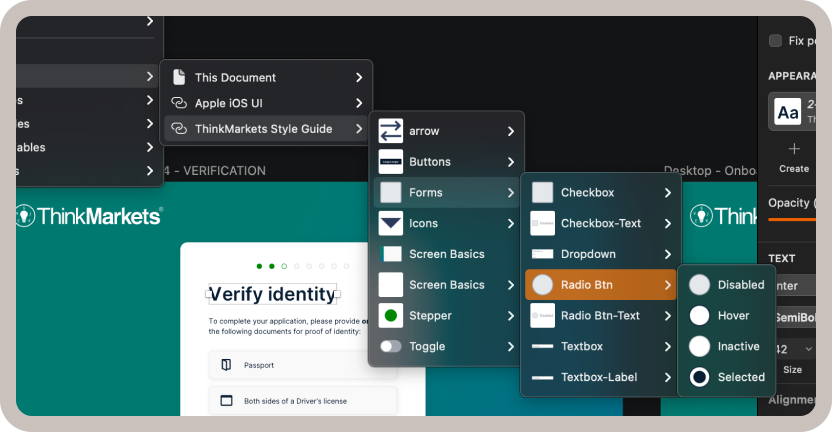
Designing Core Components
A major focus of the design phase was building atomic components that would form the foundation of the design system. These components were designed to be reusable, accessible, and scalable, ensuring consistency across ThinkMarkets’ platforms. I contributed directly by designing some of these components, each with defined states like hover, disabled, and active. Buttons were developed with primary, secondary, and tertiary styles to accommodate diverse use cases, while list components were created to support navigation and data presentation. By focusing on these foundational elements, the team delivered a cohesive system that streamlined workflows for both designers and developers.

Collaboration With Engineering
To ensure a seamless implementation of the design system, I worked closely with the engineering team throughout this phase. This collaboration was crucial in bridging the gap between design and development.
How I Collaborated with Engineering:
- Conducted regular handoff sessions to align on technical requirements.
- Worked alongside engineers to ensure components from the design library were correctly implemented in code.
- Provided feedback and testing during the development process to address technical challenges early.
This partnership ensured the design system was successfully integrated into ThinkMarkets’ platforms, making it functional for both designers and developers.
Documenting the Design System
To ensure the design system was easily accessible and adoptable across the organization, we created a centralized library in Sketch. This library allowed designers to seamlessly pull in components, colors, and typefaces for their projects, streamlining their workflows and ensuring consistency across all designs.
Additionally, I published comprehensive documentation on our SharePoint, providing a single source of truth for the entire team. This repository detailed how to use the design system effectively, including component states, typography usage, and color guidelines.
With the design system implemented, it addressed key inconsistencies and empowered teams to work more efficiently. The scalable foundation laid the groundwork for lasting improvements in user experience and internal workflows.
Impact
Key Outcomes
The design system delivered measurable benefits across both the development and user experience. Here are the key outcomes:
- Streamlined Development: The ready-to-use library of components, colors, and typography allowed the team to create high-fidelity interfaces efficiently, reducing overall design and development time.
- Focused Innovation: With standard components in place, the design team could focus on solving complex problems rather than recreating foundational UI elements.
Consistent User Experience: The unified design system ensured a consistent and cohesive interface across platforms, improving user trust and satisfaction.
Next Steps and Future Opportunities
While the current design system provided significant value, there are opportunities for further expansion:
- Motion Design: Incorporating animation and micro-interactions to elevate user engagement and guide users through the interface.
- Illustration and Photo Treatment: Developing a cohesive style for visual elements to strengthen the brand identity and enhance storytelling
- Enhanced Copy Guidelines: Establishing tone and style guidelines for content to ensure consistent messaging across all touchpoints.
Final Thoughts
The impact of the design system went beyond efficiency gains; it became a foundational tool that empowered the team to deliver exceptional user experiences at scale. By focusing on scalability and usability, the system not only addressed immediate project needs but also laid the groundwork for future growth and innovation.
Selected Works