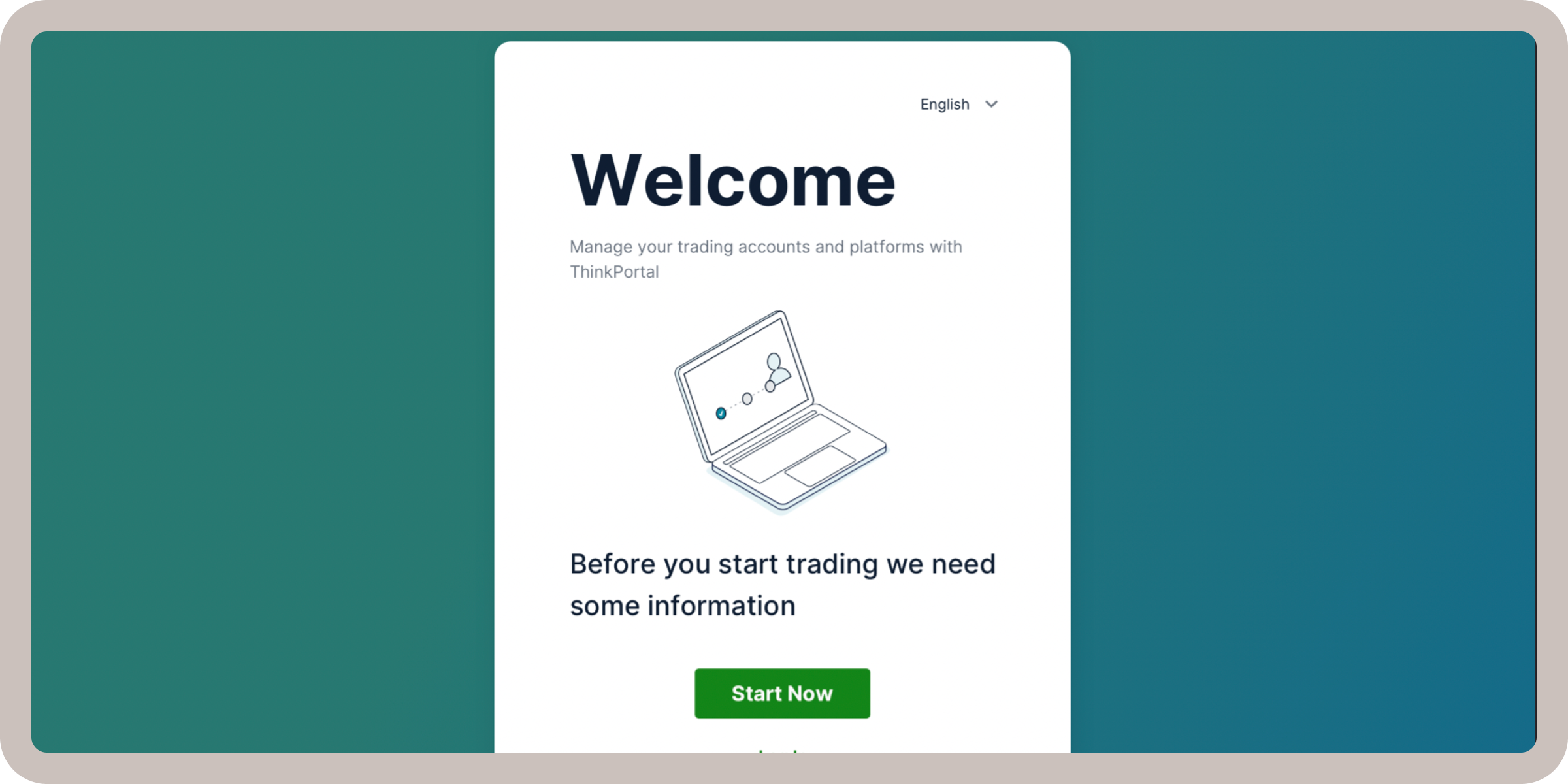
Building ThinkMarkets' Design Foundation
Summary
- My Role: I spearheaded the ThinkMarkets Onboarding redesign from inception to delivery, balancing regulatory compliance with a user-focused experience.
- Team: Collaborated with an additional product designer, a product manager, and a developer.
- Duration: 6 weeks.
- Overview: The main objective was to revitalize ThinkMarkets’ onboarding flow to reduce complexity, inspire user trust, and increase successful completions. By conducting thorough research, gathering insights from stakeholders, and applying user-centered design principles, the team achieved a 17% improvement in successful account creation. This redesign ultimately offered a clear, compliant, and user-friendly onboarding experience.
Introduction
ThinkMarkets is a global fintech company requiring users to complete a rigorous and lengthy onboarding process. As a result, the organization has seen heavy user drop-off, negatively affecting new account activations. This project aimed to redesign the onboarding process to boost completion rates while maintaining compliance and user trust. By taking a user-centric approach—walking through the journey ourselves and gathering direct feedback—we hypothesized that simplifying key steps and providing clear progress indicators could significantly reduce drop-off.
The Research Phase
Understanding the Problem
In the first few weeks, we focused on analyzing the application’s existing flow and identifying potential limitations. As part of this effort we immersed ourselves in the current user journey by completing the onboarding flow as “new users,” carefully noting each form field and step. This exercise revealed precisely where information broke down and bottlenecks occurred. After experiencing the journey firsthand, we mapped each step in a detailed journey map, documenting where users might hesitate, encounter confusion, or require additional guidance.

The above flowchart captures the depth and branching logic of the ThinkMarkets onboarding. Each color-coded box represents a form step or decision point (e.g., “Upload ID,” “Select Account Type,” “Enter Personal Details”). The sheer number of steps made it clear why users might abandon the process midway.
Key Goals for Research
Before diving into ideation, we needed a clear understanding of user frustrations, business objectives, and the broader competitive landscape. We established the following goals:
- Identify User Pain Points:
Pinpoint the most critical issues causing drop-offs or confusion in the onboarding process. - Align with Business Objectives:
Ensure we fully integrate compliance and growth targets throughout our improvements. - Benchmark Competitors:
Investigate best practices in fintech onboarding to uncover innovation opportunities and set competitive standards.
Our Process
- Gathering Quantitative & Qualitative Data:
We began by analyzing Hotjar recordings and Google Analytics data to see how users interact with the onboarding flow. These tools helped us pinpoint high-exit screens and click patterns that suggested friction. However, data alone couldn’t tell us the entire story; we wanted to understand why users dropped off, not just where.
To gain deeper insights, we also leveraged feedback from our internal support team, who have daily contact with users encountering onboarding issues. This combination of quantitative metrics and qualitative anecdotes gave us a more holistic understanding of user pain points. - Stakeholder Interviews & Competitive Analysis:
After a thorough analysis of the existing app and flow, we engaged with key stakeholders from compliance, product, and customer support. Their domain knowledge provided clarity on which parts of the onboarding were non-negotiable for legal reasons and which aspects could be streamlined.
Additionally, we researched six direct and indirect competitors to see how they structure onboarding, manage compliance, and visually communicate steps. By contrasting ThinkMarkets’ flow with others, we identified design patterns and messaging that could potentially reduce user drop-off and instill trust. - Synthesizing Findings:
We compiled our findings into a central repository, noting both internal feedback (e.g., stakeholder priorities) and external observations (e.g., competitor best practices). From these insights, we formed working hypotheses about how to address each major friction point—ultimately fueling the design decisions in the Ideation and Design phases.
Research Outcomes
Our research uncovered three core issues that were consistently impacting the onboarding experience:
- Content is Not Organized:
Similar questions were split across multiple screens without logical grouping, causing users to re-enter information and lose context. - User Progress is Not Disclosed:
Without a clear progress indicator, users do not understand how many steps the onboarding journey will take them. - Interface is Not Up to Date:
The overall visual design felt outdated and cluttered, which undermined trust. Users expect a modern, professional interface from a global fintech service.
By pinpointing these core pain points, we could strategically prioritize the features and design elements most likely to improve onboarding completion. In the upcoming sections, we’ll explore how these insights shaped our ideation and design process, ultimately resulting in a more streamlined, user-focused onboarding flow.
Ideation Phase
Reorganizing Content & Shortening the Flow

To begin the ideation process, we revisited the entire onboarding flow with the goal of combining or eliminating redundant steps. As shown in the whiteboard sketches above, we laid out each screen and requirement, then explored how to group related information (e.g., personal data, financial background) in a logical sequence. This reorganization ensured users would progress smoothly through fewer steps, reducing confusion and cognitive load.
Low-Fidelity Wireframes & Quick Iterations

Before committing to high-fidelity designs, we created grayscale wireframes to validate our ideas with both internal stakeholders and test users. Working in grayscale allowed us to iterate rapidly, focusing on flow and content hierarchy rather than polished visuals. We shared these wireframes with the engineering team early on, giving them advance notice about potential back-end adjustments—a crucial step, since the new flow could significantly affect data capture and compliance checks.
Adapting the Flow for Multiple KYC Requirements

A key challenge was to accommodate different entities under ThinkMarkets that each had unique KYC questions. We addressed this by creating a modular journey map where content was bucketed into categories (e.g., identity verification, financial background) that could be dynamically rearranged based on the user’s region or account type. As illustrated above, color-coded nodes represent each KYC segment, ensuring the system could scale and remain compliant across various jurisdictions.
Design Phase
Crafting a Modern UI

The existing interface felt outdated and did not inspire user trust, so we focused on modernizing the visual language while ensuring security and clarity. Key enhancements included:
- Clean, Contemporary Aesthetic
We introduced a streamlined layout, consistent typography, and brand-aligned color schemes to establish professional credibility - Error States & Real-Time Validation
Users can now correct mistakes as they go, preventing them from getting stuck in the flow. - Password Criteria & Hints
Clear guidelines for creating a secure password reduce confusion and improve overall account safety. - Progressive Disclosure
We revealed only the necessary fields at each stage, keeping users from feeling overwhelmed by forms.
By building a UI that looks and feels both professional and secure, we aimed to build trust from the very first interaction.
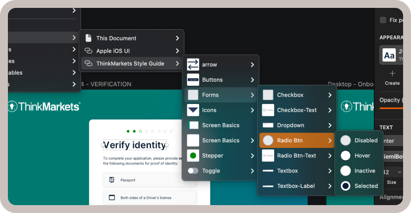
High-Fidelity Screens & Brand Alignment
As we moved from low-fidelity prototypes to high-fidelity designs, we fully integrated ThinkMarkets’ brand guidelines and design system components. This allowed us to:
- Leverage a Consistent Design System
From typography to button styles, we utilized reusable components that not only maintained visual consistency but also streamlined collaboration with engineering. - Enhance Brand Cohesion
Every screen reflects ThinkMarkets’ new brand identity, reinforcing user trust and familiarity throughout the onboarding journey. - Simplify Developer Handoffs
By working within a robust design system, developers received clear specifications—from spacing tokens to color variables—making implementation more efficient and reducing errors.
This holistic approach ensured that the final UI wasn’t just modern and user-friendly, but also deeply aligned with ThinkMarkets’ evolving brand presence.
Reorganizing Content
As identified in our research, disorganized questions led to user confusion and unnecessary repetition. In the new onboarding flow, we strategically grouped related fields into screens with clear titles, such as:
- Personal Information
- Contact Details
- Platform Selection
- Financial Details
- Experience
This structure helps users grasp why they are providing certain data and prevents them from encountering duplicate or out-of-context questions.
Visualizing Steps

Previously, users had no clear indication of how many onboarding steps remained, often leading to abandonment. To address this:
- We introduced step bubbles at the top of each screen, showing progress and remaining steps in real time.
- Each step includes a concise title, reinforcing which portion of the process is underway (e.g., “Contact & Address,” “Platform Selection”).
By visualizing the onboarding journey, users can pace themselves, feel in control, and maintain confidence that each step brings them closer to completion.
Bringing It All Together
Through a combination of modern UI principles, structured content grouping, and clear progress indicators, the redesigned onboarding process offers a shorter, more intuitive experience. By focusing on progressive disclosure, clear error handling, and strong security cues, we aimed to create an onboarding flow that feels professional, trustworthy, and straightforward for new users.
Design Delivery
Once we finalized the high-fidelity designs, handoff to product managers and engineers became critical. To ensure a smooth transition, we leveraged Zeplin for both visual references and in-depth annotations:
- Organized Zeplin Files
I structured each screen within Zeplin so the engineering team could quickly identify component details, including size, spacing, and color tokens. - Understand Page Behavior & Edge Cases
I added comments directly in Zeplin to explain unique interactions, error states, and any conditional behaviors. This level of detail minimized guesswork for developers and clarified how each screen should respond in different scenarios. Writing User Stories
In collaboration with the product manager, I took the lead on writing user stories that captured each screen’s functionality and acceptance criteria.
By aligning designs, annotations, and user stories in a single place, we created a seamless handoff experience. The engineering team had all the context they needed—from interaction specifics to technical requirements—and the product manager could track feature progress with clarity. This tight collaboration set the stage for an efficient implementation that remained true to the user-focused vision established throughout the project.
Retrospective
After the redesigned onboarding flow went live, successful applications increased by 17%, validating many of our design assumptions. This improvement reinforced how impactful a user-centric, visually cohesive onboarding journey can be for both business goals and user satisfaction.
Looking ahead, as ThinkMarkets expands into new markets, the onboarding journey will require ongoing updates to accommodate diverse KYC processes. Additionally, introducing adaptive error messaging—where hints evolve based on user input—could further reduce friction and encourage more successful completions.
By delivering a modern, brand-aligned onboarding flow and carefully coordinating the handoff to engineering, we transformed a lengthy and confusing process into one that’s engaging, efficient, and scalable for future growth. This case study underscores the value of collaboration, research-driven design, and continuous iteration in achieving tangible results.
Selected Works