Improving Visibility in the Venture Funnel
Summary
- My Role: I led the design of the Deal Metrics Dashboard, guiding the project from early research through final implementation. My focus was on bringing clarity to the data while supporting existing workflows.
- Team: Worked closely with head of product and an engineer.
- Duration: Q2 2024
- Overview: This project introduced a new layer of visibility into Initialized Capital’s venture pipeline. I designed two core visualizations to help partners see how long deals were spending in each stage and how many companies were active across the funnel. These insights improved deal flow visibility and helped the team identify bottlenecks, prioritize follow-ups, and make more informed decisions. By integrating the dashboard without disrupting the existing table layout, we increased efficiency while keeping the interface intuitive and aligned with day-to-day use.
Introduction
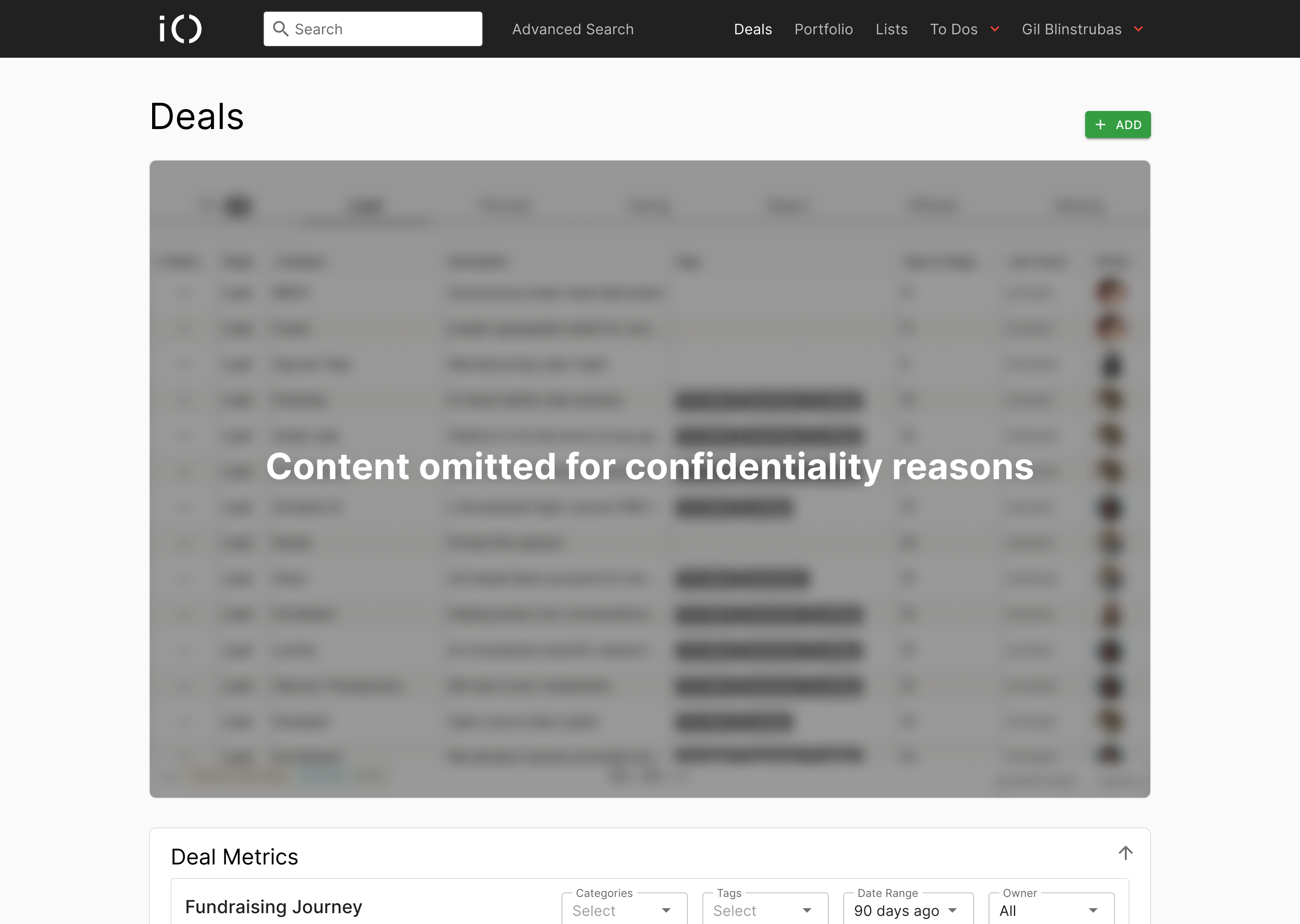
At Initialized Capital, the Deals Table is where everything happens. It’s the source of truth for startup activity across the firm’s investment pipeline. But while the table gave a real-time view of each deal’s current stage, it lacked visibility into how deals actually moved over time.
Partners were left with a few blind spots. A few of them being how long deals stayed in each stage, where bottlenecks emerged, and which opportunities were stalling out. I designed a lightweight, embedded metrics dashboard to bring that missing context directly into the interface they already relied on.
Requirements & Early Exploration
This project began as a request from a managing partner who wanted more clarity around how deals were moving through the pipeline. While this didn’t begin with traditional user research, it opened the door to a foundational discovery phase.
I synced early with both the managing partner and our head of product to understand what metrics we actually wanted to capture. Two metric priorities quickly emerged:
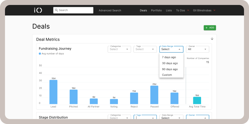
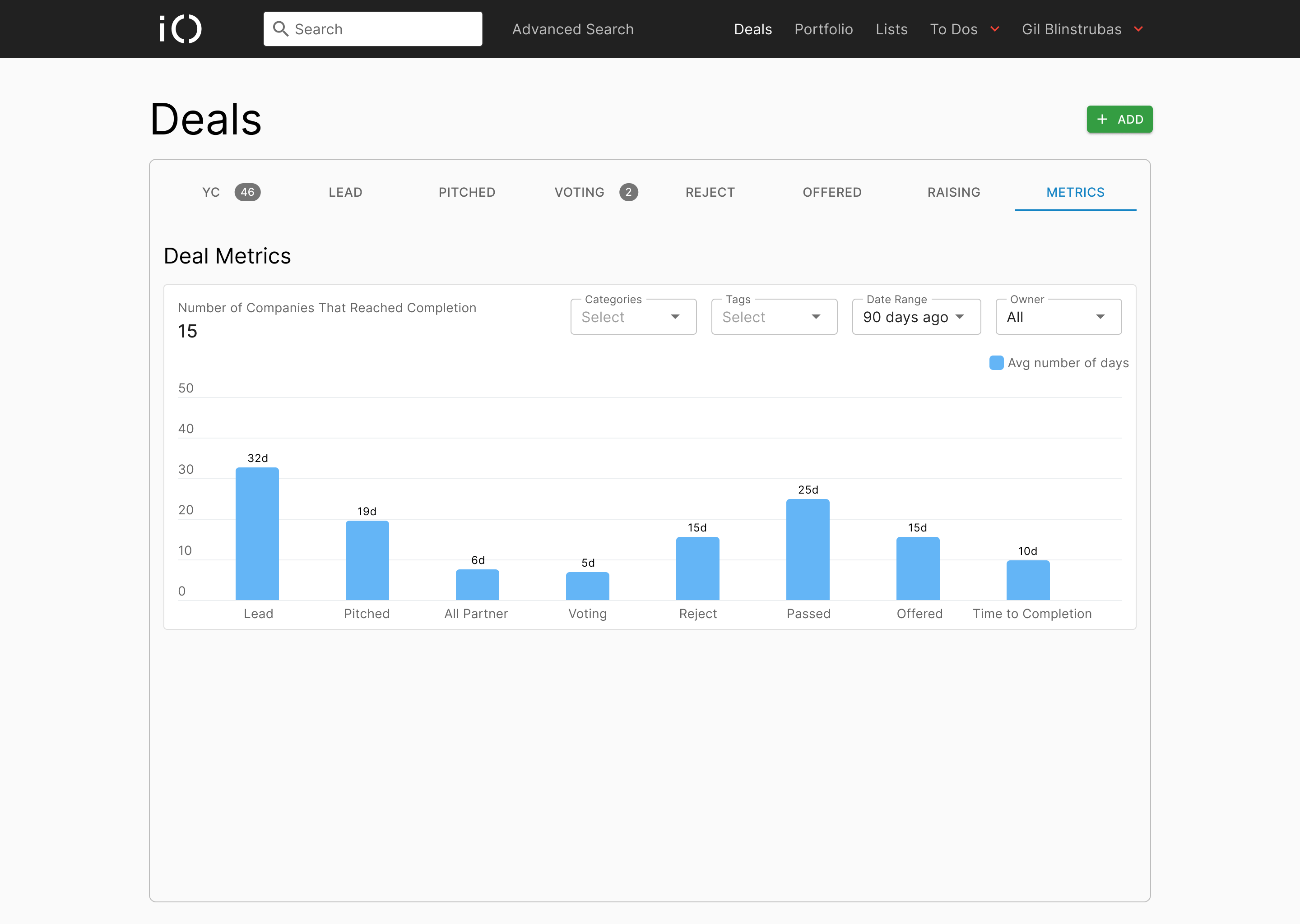
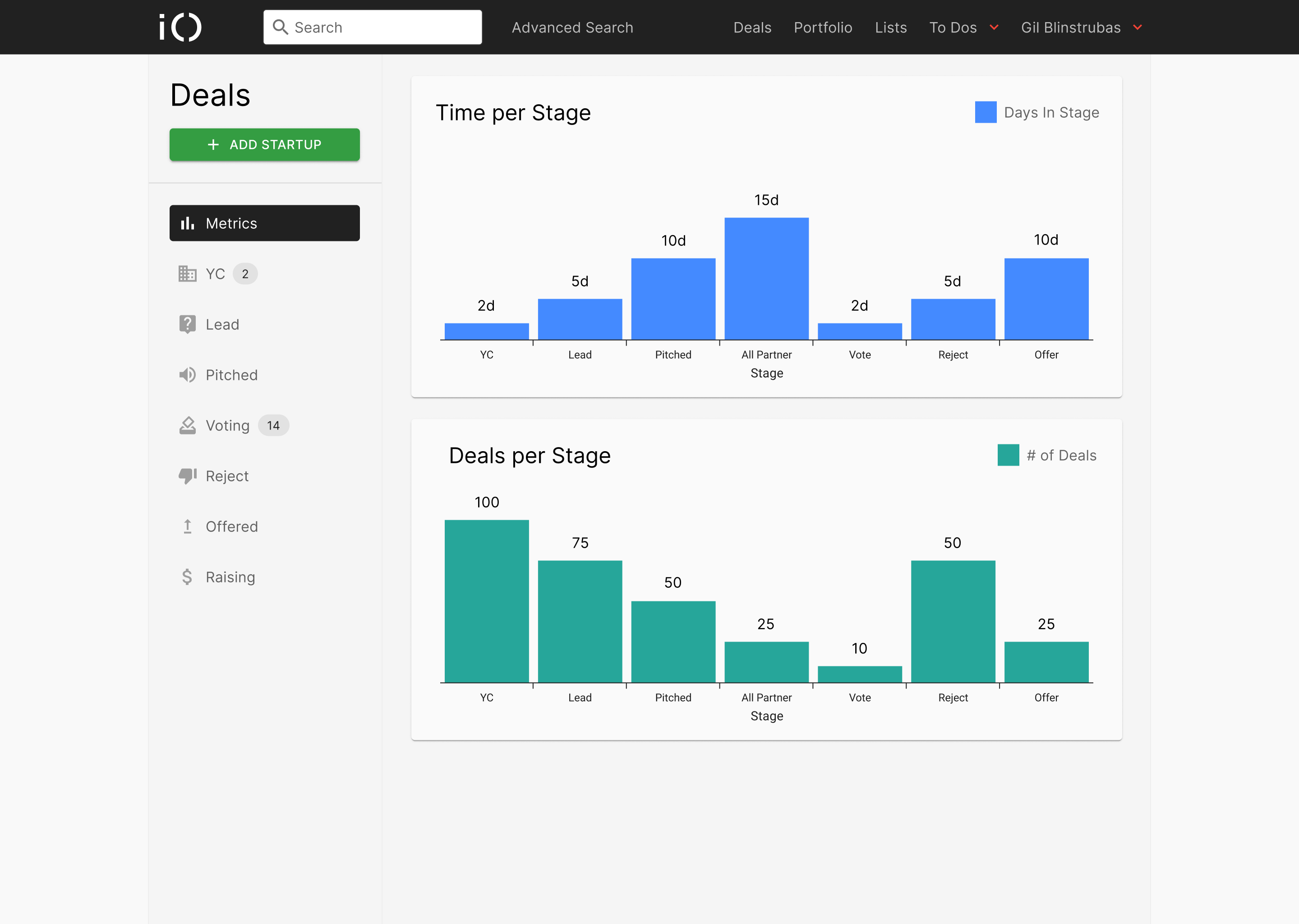
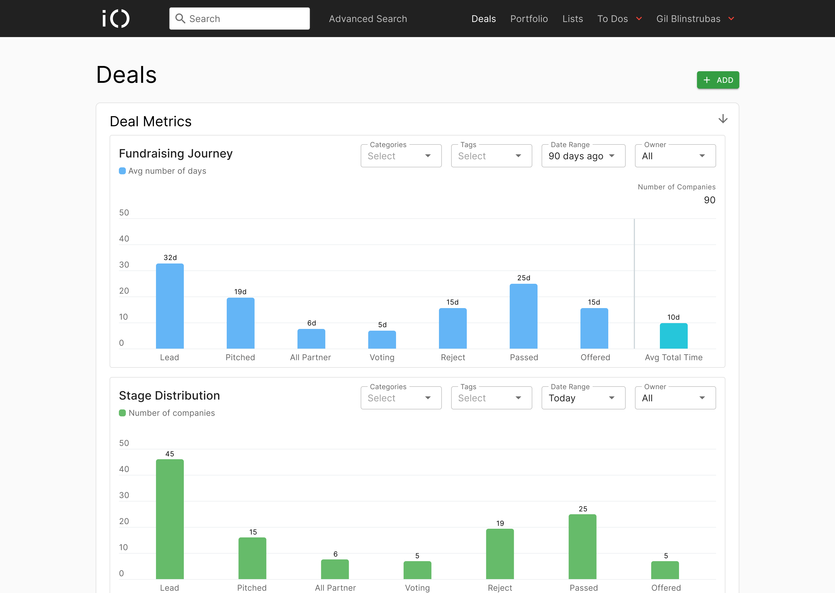
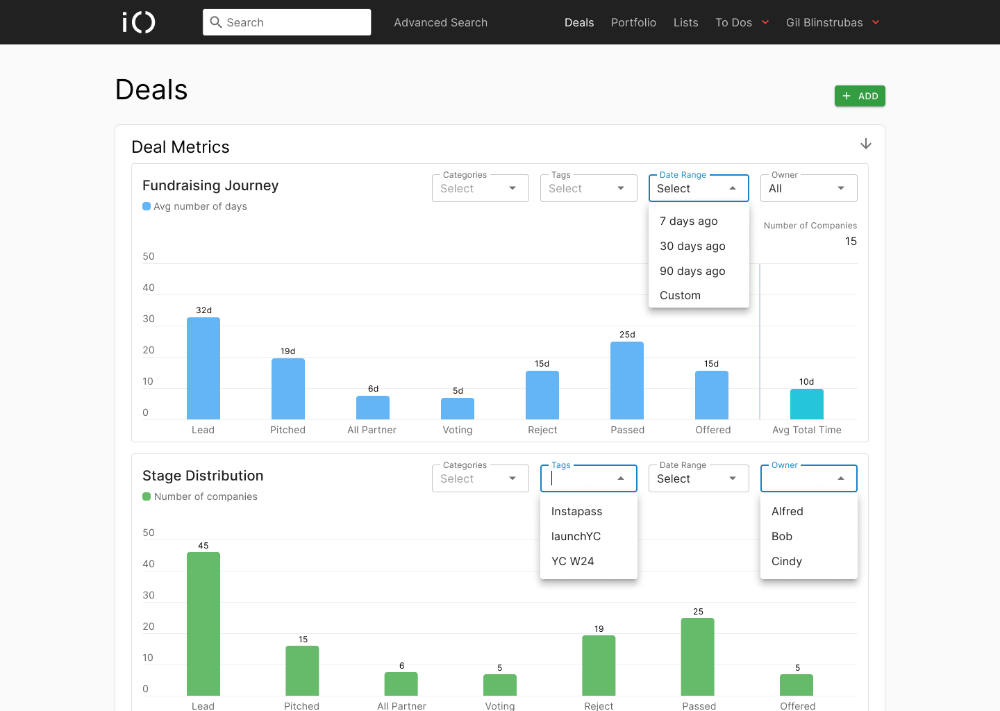
- Fundraising Journey: How long companies spend in each stage
- Stage Distribution: How many companies move through each stage during a given timeframe.
To ground this work, I reviewed old internal design files from five years ago. These early concepts had explored similar ideas, but they never shipped. Revisiting them gave me insight into past thinking, partner expectations, and where previous efforts were left off.
I also created a lightweight PRD to align the team, define the scope of what we’d track, and ensure this initiative fit alongside other roadmap items.
But defining what we wanted to show was only part of the challenge. The bigger lift came in figuring out how to show it accurately.
I started sketching out potential visualizations using the original parameters, but the math for these parameters didn’t make sense. Stage timelines weren’t consistent. Date cutoffs created gaps. Deals jumped or skipped stages. It quickly became clear that without refining the logic behind the metrics, we couldn’t move forward.
So I paused interface work and partnered closely with one of our engineers to map out and validate the underlying system. We modeled edge cases, defined what a “completed” deal entailed, and questioned what counts as time in a stage. We also had to consider how date filters would interact with the math.
Figuring out the math andproper metric calucation was the most critical phase of the project. Getting the structure right ensured that what we visualized would actually be trusted and useful. Once we had confidence in the model, we were finally ready to move into design ideation.
Ideation
With the metrics model in place, I shifted into design ideation where the challenge became balancing insight and space.
I began thinkg nthrough how could we introduce new visualizations without disrupting the existing workflow. Since the Deals Table was the anchor of this page, and partners relied on it heavily, any solution needed to complement it, not compete with it.
I explored a range of directions:
- A redesigned navigation structure where metrics lived in a separate section
- A side-by-side layout with the table and visualizations sharing space
- A modular layout where the metrics could live at the top and collapse on scroll
- A slider-style panel where partners could drag the metrics view upward, dynamically resizing the table
Each of these concepts was driven by a mix of low-fidelity sketches and quick high-fidelity frames. My exploration process often lives between the two. I use just enough fidelity to communicate intent, spark critique, and speed up iteration. These aren’t polished visuals, but they help visualize structure, spacing, and interaction early on.

Alongside layout, I also began experimenting with chart types. I tested:
- Pie charts (too limited in comparison)
- Sankey diagrams (visually interesting, but difficult to scan)
- Stacked bars (too dense)
- Line graphs (didn’t match the categorical structure)
- Horizontal bar charts (clear, fast, comparative)
This phase wasn’t just about figuring out the UI, it was about finding a clear and effective way to layer metrics into a page people already relied on. After working through a few directions and syncing with the head of product, we decided that for version one, the best approach was to keep the Deals Table as the focus and place the metrics in a lightweight section above it.
It was a simple decision that worked well and allowed us to introduce new insights without changing how people used the page, which made it easy to adopt and build on.
Design & Interaction
Once the direction and layout were set, I moved into refining the interaction and visual details. The goal was to create a clean, glanceable experience that fit seamlessly into the existing page, while still giving users the ability to explore deeper when needed.
Early exploration had already made it clear that horizontal bar charts were the best fit. They offered quick scanability and made comparisons across stages easy to interpret. We knew we wanted to support a sliding interaction that allowed users to expand or collapse the metrics area depending on their needs, so I began building this concept out in higher fidelity to visualize how the interaction would actually feel.
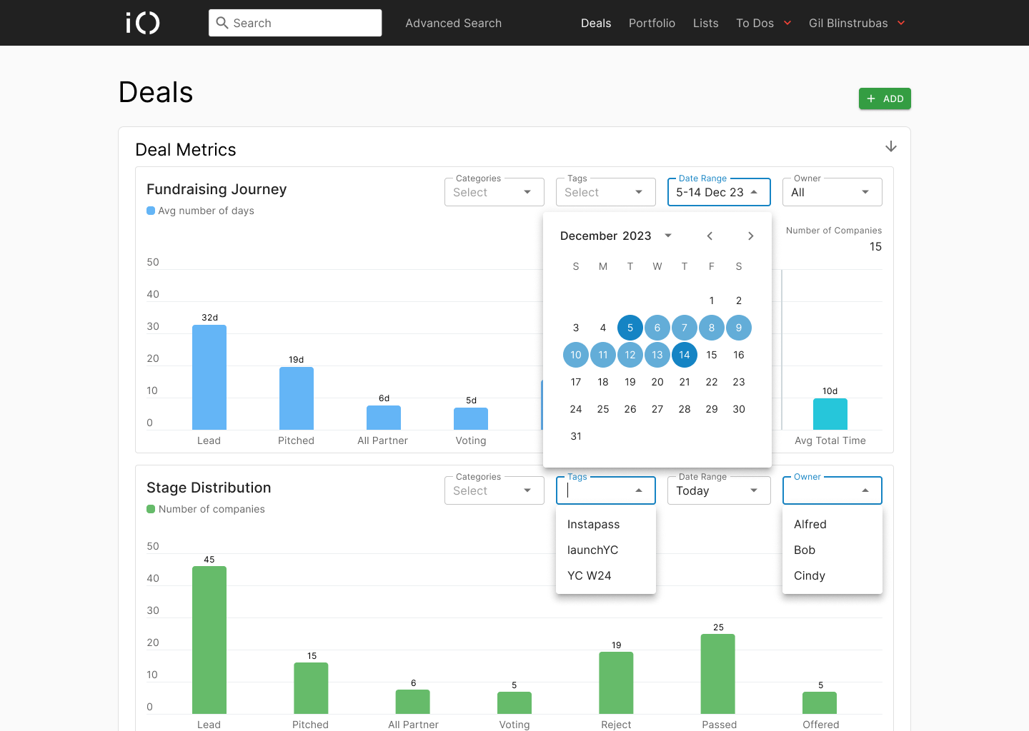
I also designed the filtering system for the charts, allowing users to narrow the data by owner, category, tag, or date range. These filters were modeled on patterns that already existed within Folio, so they felt familiar while providing new flexibility.
We used the MUI design system as our base, which made it easy to work with their charting components for this first release. The flexibility of MUI allowed us to focus more on structure and interaction, knowing that engineering could integrate those components quickly.
To support the visual logic of the dashboard, I added a key to the fundraising journey chart, introduced an average total time metric, and ensured that chart legends and tooltips were clear and helpful.
For this initial release, we kept the existing Bootstrap table that was already in place, rather than upgrading it to a MUI component. Doing so allowed us to move quickly. In version two, we started exploring a modernized table layout with more breathing room and a cleaner hierarchy, but for the first version, simplicity and speed were the priority.
Before going live, we reviewed the design with the managing partner to gather feedback. That review helped confirm the need for a total time metric in the fundraising journey, which we included in the final output.
The interaction itself wasn’t complex, but it was thoughtful. Users could slide the metrics into view when needed, and then easily return to the Deals Table without friction. The result was something that felt like part of the page, not a new tool layered on top of it.
Impact
The metrics dashboard gave the team a much clearer view of how deals were moving through the pipeline.
It helped the managing partner track where companies were getting stuck, and it surfaced stage-specific delays that would have otherwise gone unnoticed. The average total time metric added another layer of insight, making it easier to compare deal pace across owners or categories.
Beyond the numbers, the dashboard supported better conversations during pipeline reviews. The data gave partners a shared view of what was happening, which made follow-ups more focused and actionable.
This project also laid the groundwork for future improvements. The dashboard didn’t try to change how people worked. It just added clarity to what they were already doing.
Reflection
This project reminded me how much design work happens before anything visual takes shape.
Defining the right metrics, modeling edge cases, and making sure the data actually told a meaningful story took just as much effort as the interface itself. It reinforced the importance of partnering closely with engineering early on and staying curious when things don’t line up the way you expect.
I also learned that clarity often comes from subtraction. By keeping the design lightweight and layering it into an existing workflow, we were able to introduce something valuable without asking users to change their habits.
It wasn’t a flashy launch, but it was a thoughtful one. And sometimes, that’s the work I’m most proud of.
Selected Works